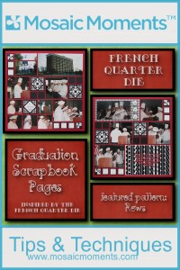
Pattern Style Focus: Rows
Feature Die:French Quarter
Our French Quarter Die reminds me of New Orleans and the wrought-iron balconies and rails in the French Quarter section of town.
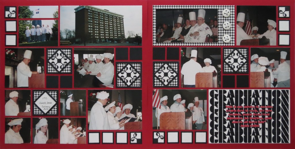
I was young when my parents took us to NOLA for a few days on our vacation. I remember being disappointed that the French restaurant we had lunch in did not serve French fries. Oh, to be eight again! While I still enjoy French fries, I have to say, that we’ve tried many other culinary delights over the years courtesy of my daughter Hannah. Always one to enjoy cooking and baking, her dream was to attend culinary school…and she did. These pages remember her graduation from Culinary School.
The color choices are a Brick Red 12×12 Mosaic Moments Grid, along with Black and White to reflect the Traditional Chef’s Uniform and Die Sets ABC and D were used to complete the project.
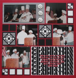
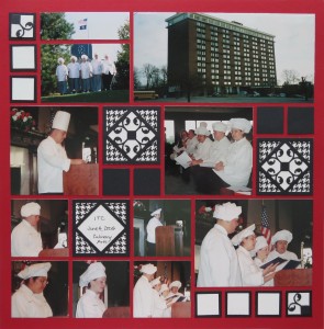
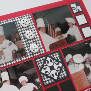
In this layout I will use our French Quarter Die as an accent piece. It seemed to be the perfect choice for a culinary layout. Our Pattern Gallery feature is Pattern #221, one of many of our Row Patterns. I’ve used it for both pages, but on the second page flipped it for an almost mirror image, making a few adjustments with the lower 6-2×2’s to use as a single title spot. The top right 3×3 photo remains whole instead of dividing it into two sections to follow the page pattern.

French Quarter Die
Using the French Quarter Die Three Ways:
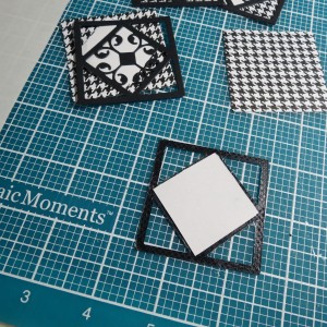
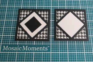
- The first way in the center row section is with a double underlay. A 2×2 background tile is cut from a black and white hounds tooth patterned paper that reflects the traditional chef’s uniform. The second background tile is a white square cut with EK Success 1 3/8” square punch so that the center design stands out prominently.
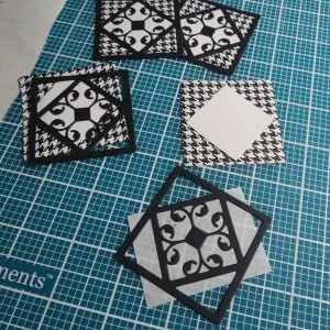
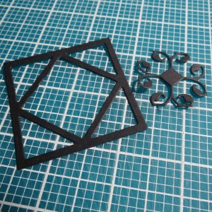
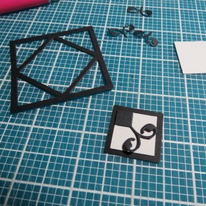
French Quarter Die-Graduation Pages Step one: use Stick It! to adhere white tile to back of flourish
- The second way the French Quarter Die was used was to create a spot for a brief journal spot. The center motif is carefully trimmed out leaving the frame work intact. A white square placed beneath allowed for journaling.
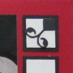
- The third way was to use the trimmed out motif for another tile embellishment. This time trimming away three of the flourish sections leaving one with the center square whole. It was then mounted in the corner of a ¾” white square, that was in turn mounted on a black 1” square. This gives the illusion of the motif being a part of the base black tile. These tiles were set in the corners. The additional 1” tiles in these clusters are also ¾” white tiles on 1” black tiles.
Using the French Quarter Die Three Ways:
- The first way in the center row section is with a double underlay. A 2×2 background tile is cut from a black and white hounds tooth patterned paper that reflects the traditional chef’s uniform. The second background tile is a white square cut with EK Success 1 3/8” square punch so that the center design stands out prominently.

French Quarter Die-Graduation Pages Step one: use Stick It! to adhere white tile to back of flourish
- The second way the French Quarter Die was used was to create a spot for a brief journal spot. The center motif is carefully trimmed out leaving the frame work intact. A white square placed beneath allowed for journaling.
- The third way was to use the trimmed out motif for another tile embellishment. This time trimming away three of the flourish sections leaving one with the center square whole. It was then mounted in the corner of a ¾” white square, that was in turn mounted on a black 1” square. This gives the illusion of the motif being a part of the base black tile. These tiles were set in the corners. The additional 1” tiles in these clusters are also ¾” white tiles on 1” black tiles.
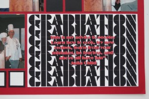
The title block was designed using the Block font. The word was repeated by using separate text blocks lined up touching edge to edge. I wanted to play up the black and white contrast and the pattern the words created. A Julia Child quote that Hannah likes was placed in the center of the graduation graphic in red.
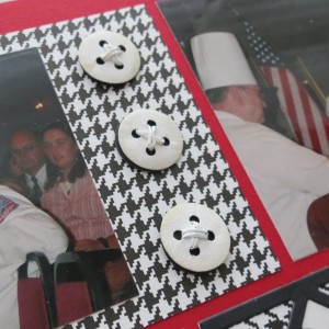
In the top left spot of page two the hounds tooth paper was used as a mat and the photo was cropped (a 3.5” x 5” which was what I was typically printing at the time) to an appropriate size for the height of the space. That left a large section to add an embellishment. What better item to use than large white buttons like the Chef’s jackets adorn?
Using EK Success’ two-punch set to create buttons, white Scrapper’s Floss for thread, glue dots, embossing tool, and grey chalk to add dimension. A white button top was roll embossed for a turned under appearance and black solid bottom to create a shadow effect. A glue dot on the white back kept the Scrapper’s Floss secure and added to the “lift” of the button that attached to the black under section.
If you haven’t tried a Row Pattern lately, now is a good time to explore the Pattern Gallery and find one that will suit your subject and give it a try. Many have 2×2 square spots that will also allow you to incorporate any one of our Cornerstone Dies. Have fun trying out new things!
Andrea Fisher
Be sure to visit our Pinterest board for more ideas…pin this:

