One Pattern Three Ways
Foil, Fabric, and Fiber: Scrapbook Trends for Summer Pages
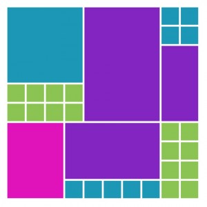
featuring Pattern #219 a puzzle pattern
A few of the dies used for these pages:
For this pattern challenge we’ll take a look at three Scrapbook Trends and how to incorporate them into our grid layouts. We’ll begin with gold foil paper, denim fabric ribbon and burlap fiber flowers to see ways to enhance our pages.
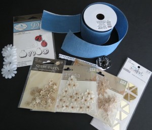
Here’s a few of the embellishment supplies I used:
Foil
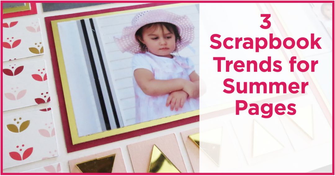
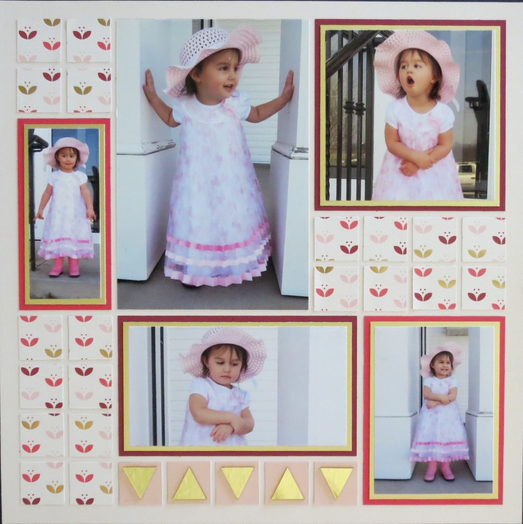
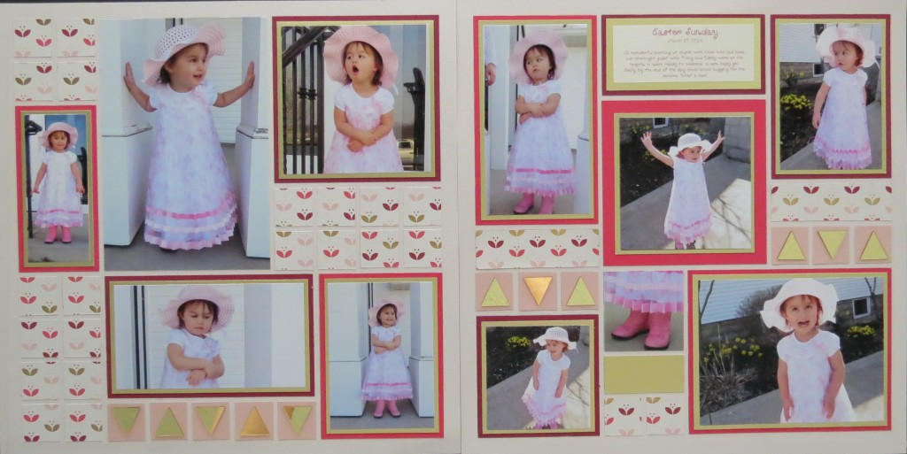
If you’ve shopped for scrapbook paper lately you’ve probably seen all the new foil papers and papers with foil accents. They are so pretty aren’t they? You can easily design a page using the pattern paper as mats, and blocks as a background but if you’d like to kick it up a notch incorporate double mats that include a solid foil mat. It’s a nice highlight to your photos and adds a bit more shimmer to the page.
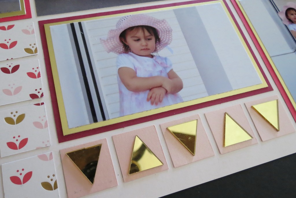
I also added something that caught my eye in the store that fits in so nicely. These are triangle gold mirrors I found at Hobby Lobby. They add a nice gold touch and reflective element plus they are lightweight to boot!
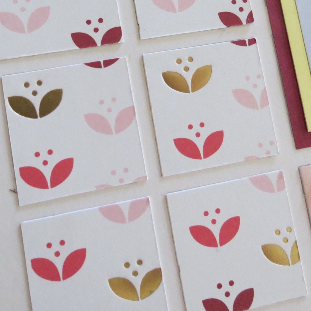
This layout is presented on Mosaic Moments 12×12 petal pink grid paper with raspberry splash and dark raspberry paper tiles for mats of the photos. I’ve used burnished gold cardstock for the double mats. I used one strip of a pink pearl paper for the 1” squares I placed the triangle tiles on. This page is done with the pattern in mirror image. The foil patterned paper is S-E-I’s Pretty Tulips.
Fabric
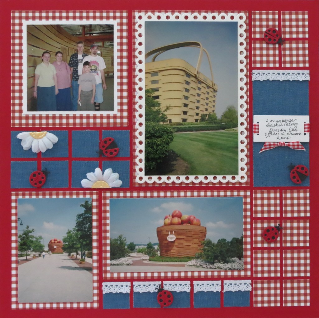
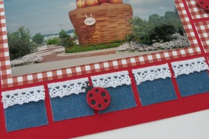
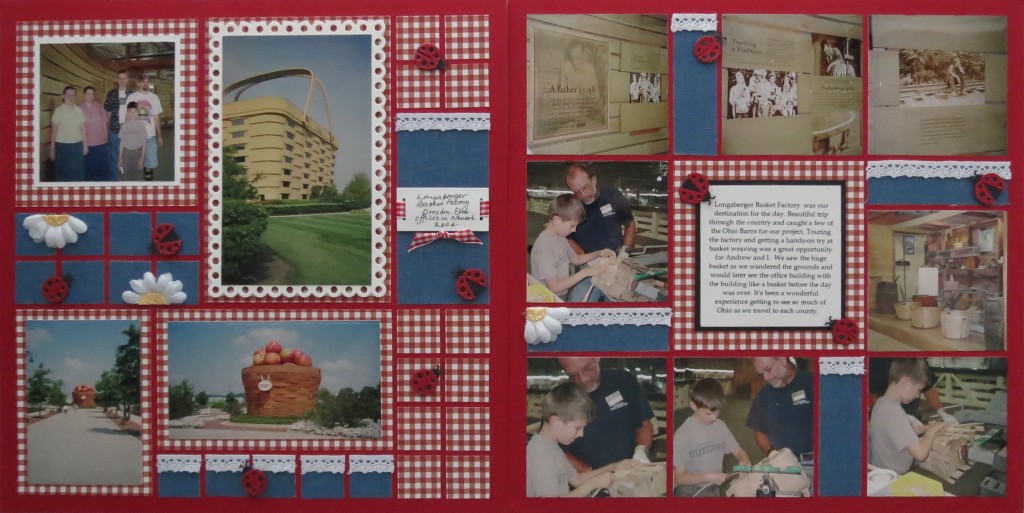
Denim is all the rage in embellishments this summer, and what a perfect one for summer. I’ve used a roll of denim ribbon that is about 2.5” wide and wired. To prepare the ribbon for the page I cut a couple of strips, removed the wire and then ran them through the Xyron machine to get full coverage on the back of the ribbon so it will lie nice and flat on the page. I used a strip of double stick tape to hold the ribbon on the craft mat to trim to the size I needed. The ribbon had sizing in it so that added to stability of the fabric. It is lighter than some of the denim embellishments you can buy so it isn’t weighing the page down.
If using fabric doesn’t appeal to you, but the look does, you will be able to find scrapbook paper in a denim print you can substitute. However, if you use ribbon you’ll have plenty left over to make other embellishments or a door wreath for the summer. $1.97 for a 3 yd. roll was a good investment.
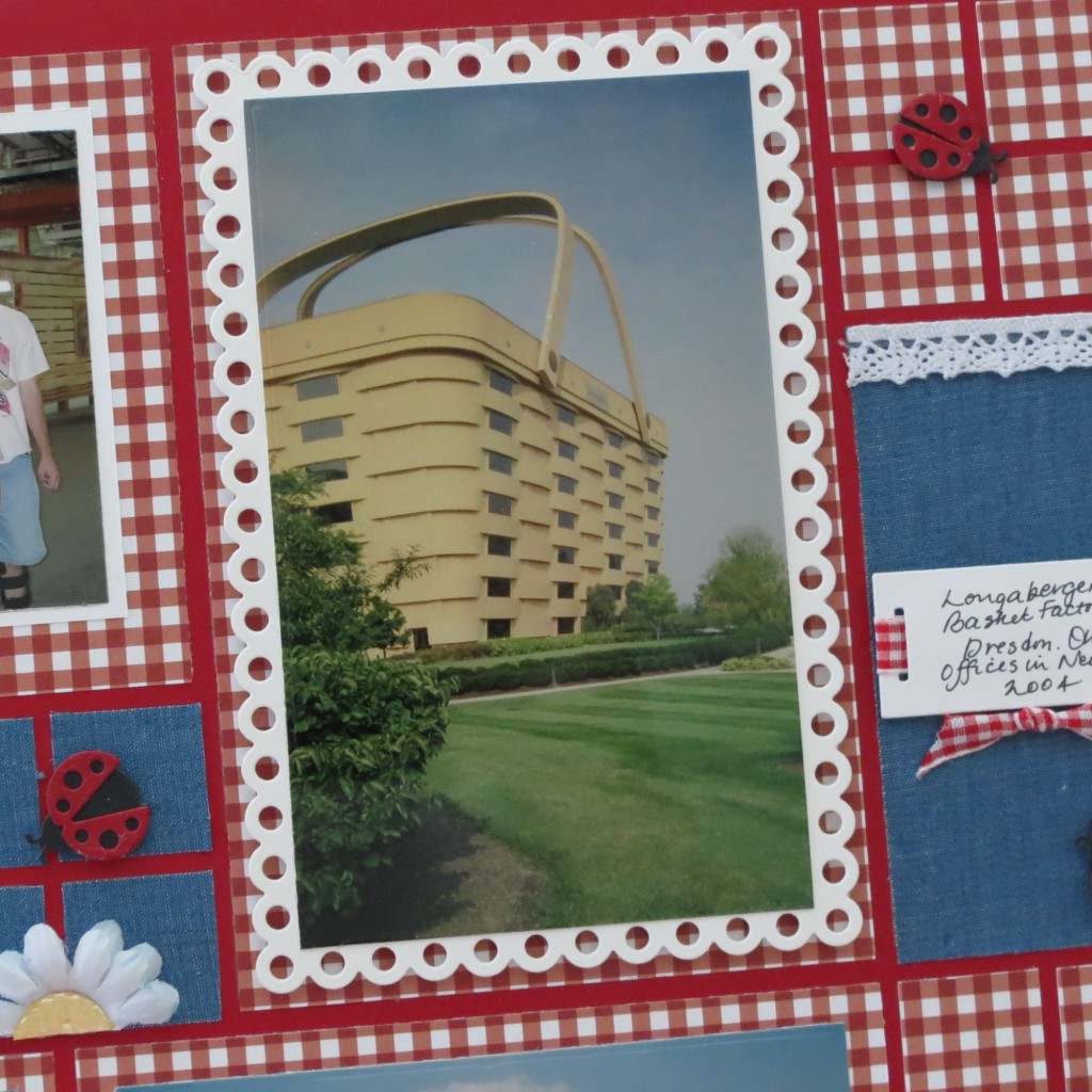
My photos are of the Longaberger Basket Factory not too far from here that the kids and I made into a day road trip. It’s a fascinating place to visit, if you make it out this way add it to your things to do list! The giant baskets are the well-known landmarks I’ve featured on this page.
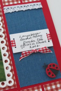
A Mosaic Moments Brick Grid Paper is the perfect foundation to work on for this layout. I’ve paired my denim with red gingham paper and lace with a rectangle Scallop Die Mat and Slider as well as daisy and lady bug accents. Seems a perfect match for a basket factory, right?
I used a strip of gingham ribbon to slip through the slider slits and mounted to the denim block using a bit of foam mounting tape.
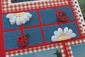
The lady bugs from an Elizabeth Craft die are randomly placed and are attached with Pop Dots.
I used two white flowers for my daisies. I cut them in half and layered the halves so that it’s nice and full. I cut a circle in yellow for the center and trimmed to fit to the edge. I layered the center with liquid pearls.
The lace is attached with a narrow strip of double-sided tape.
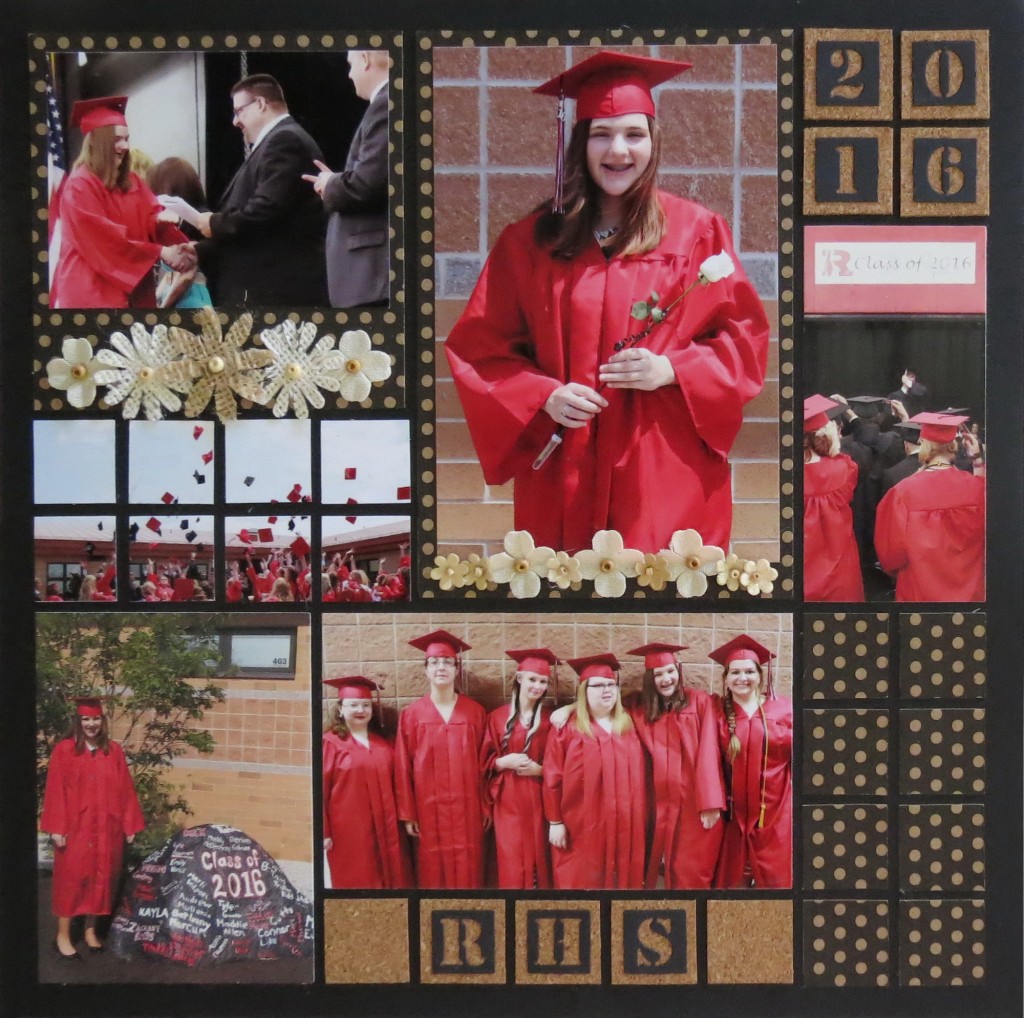
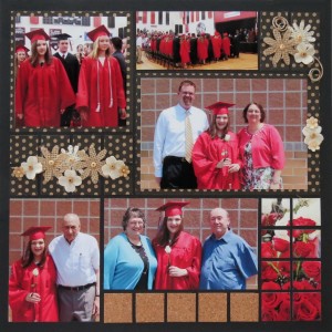
MM OTW Scrapbook Trends: Fiber Burlap flower accents, Cork tiles for this Graduation scrapbook page idea
Fiber
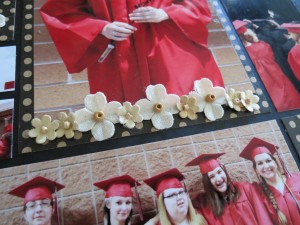
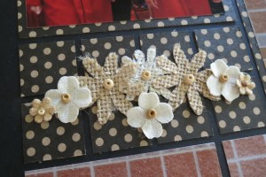
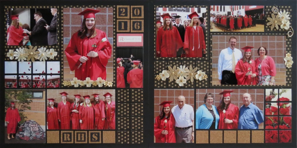
Our fiber of choice this time is burlap. Burlap flowers with beaded centers star in this graduation layout. There are additional flowers in muslin and paper all with beaded centers and some with glitter.
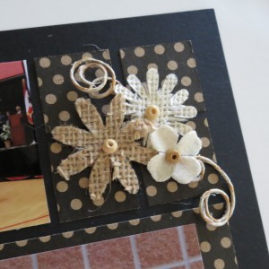
MM OTW Scrapbook Trends: Fiber Burlap Flowers, beads and jute twine formed into spiral (Aleene’s glue to hold shape)
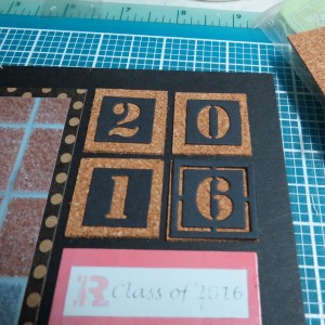
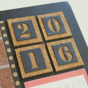
A black 12×12 grid base with a touch of Adhesive Corkstock and Black & Kraft Mini Dot Reverse both from Canvas Corp are included. Mosaic Moments Alphabet and Number dies with the outside edge removed to show off more of the cork.
In this layout I had a photo I wanted to include that would not fit in the given spots of the pattern, so I used a size to get the most from the photo and mounted it on the square dot mat and then used the space below for a flourish of flowers to enhance the page.
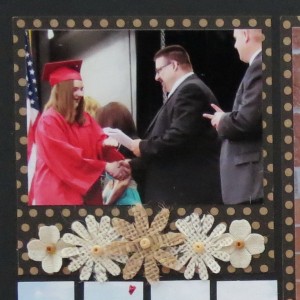
MM OTW Scrapbook Trends: Fiber Burlap flowers and cork Altering the pattern to suit a photo adding embellishments to enhance the space.
The striking contrast between the black, kraft and cream page was a nice neutral backdrop to let the school colors, red and black, bring a punch of color to the page.
I did do a companion page to go with this layout to get all the photos in with some additional embellishments. I used the same pattern #219 with a slight alteration to accommodate a large horizontal photo. A special thanks to Stephanie Murdock for the use of her photos of her daughter’s recent graduation day.
So next time you are browsing the local scrapbook shop keep your eye open for new things to try. If you have a coupon and catch a half-price sale even better! Let’s hope you have fun using some of this summer’s scrapbook trends in your layouts!
Andrea Fisher
On our Pinterest Pin Boards:
Now if you are someone who stays to the end of the movie credits you know there are often a few extras to enjoy…if you’ve stayed to the end of the article you’ll see how I finished my layouts with a second page. It was just too tempting to go ahead and do them while all the photos were out instead of the “someday” I’ll finish. Hope you enjoy this little summer bonus!

