Inspiration for Birthday Scrapbook Pages using Grid Paper, Circle Tiles, Paper Tiles and Banner Tiles from Mosaic Moments.
For today’s post I wanted to integrate a few of our Mosaic Moments products to help me do a Birthday page celebrating the recent first birthday of granddaughter #2. Here are a few…
KEY STEPS TO FOLLOW
o Begin with Inspiration paper. This will give you colors, shapes, images you may want to repeat throughout your design.
o Choose a Grid Paper to complement the inspiration page.
o Choose your embellishments: paper tiles, circle tiles, cornerstones, banners and more.
o Choose the tools to add more…pearls, gems, or stickers that you want to use.
o Plan your layout design.
o Prepare your photos according to the design.
o Execute your design, adjust as needed! If something doesn’t quite work out as first planned don’t hesitate to leave it out, save it for another layout another day.
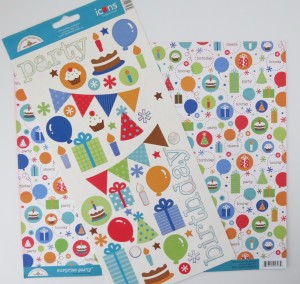
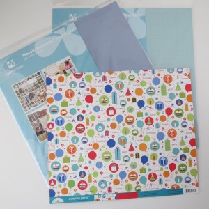
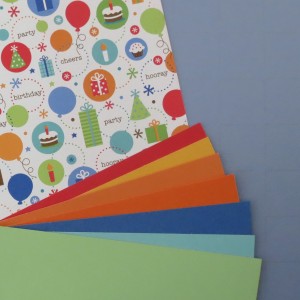
I began with a Doodlebug Design Birthday pattern paper and matching sticker sheet for my starting inspiration.
Choosing a Mosaic Moments Grid to work with my patterned page was the next step. There were several choices but I whittled it down to two and finally one. The Periwinkle (lavender blue) 12 x 12 Grid almost reads blue with this group of colors and would complement the various shades of orange in the paper.
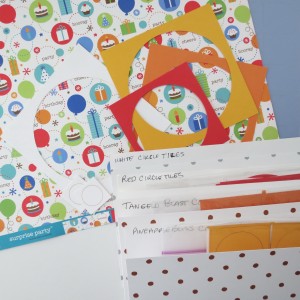
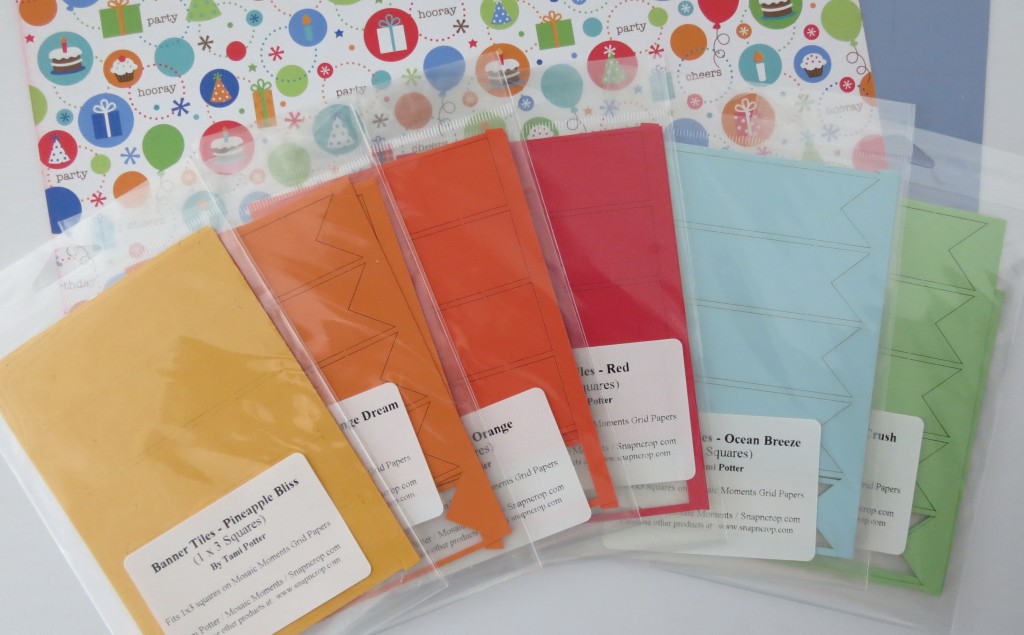
Then I wanted to pull some elements from the paper and stickers like the pops of color, the circles of dots, a banner, and maybe the stars or balloons…so I began with my stash of Mosaic Moments embellishments and pulled out colors to match the patterned paper. This is where taking advantage of a sale on Paper Tiles, Cornerstones, Banner Tiles and the many Frame Tiles we offer to have a multitude of color choices to play around with and brainstorm is well worth it to lay them all out before you and see what works for you!
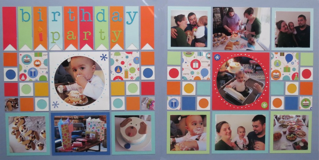
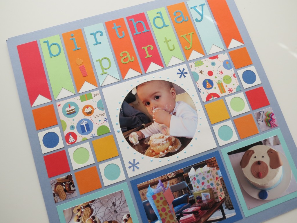
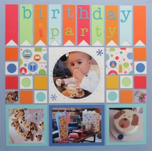
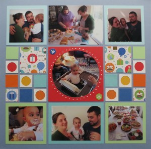
The Circle Tiles were the obvious choice and I went with white and red. There’s a lot of white space in the patterned paper and I wanted to carry that into the layout by using a generous amount of white accents.
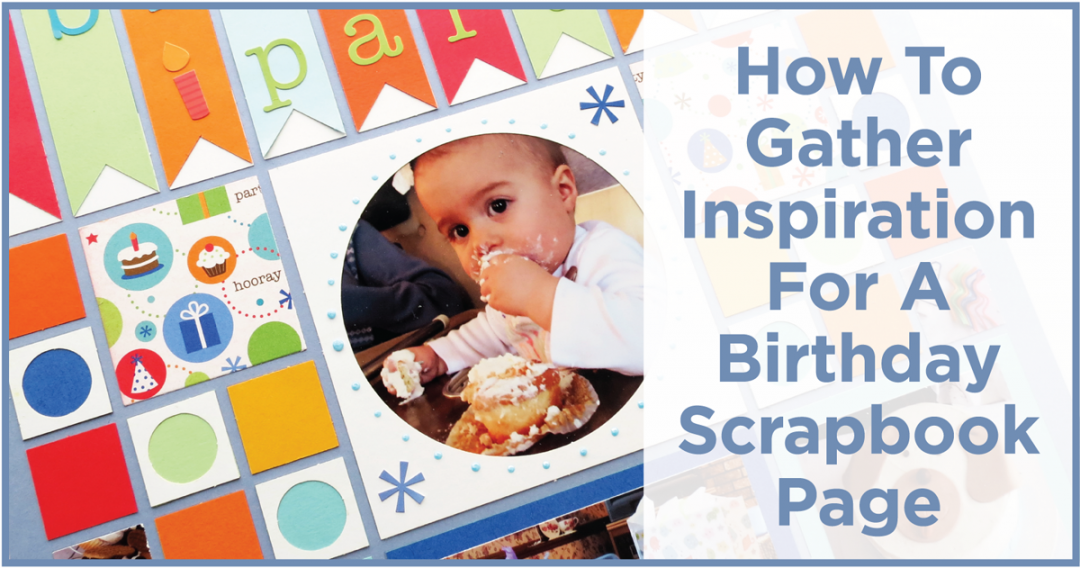
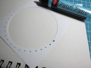
I wanted an outline of dots around the outside edge of the circle frame and chose pearl pens in light blue and ice. A circle die was used to draw around the opening giving me a path to follow and then erase once the pearls were dry. I like the dimension you get with the pearls, but a color marker circle of dots would work as well.
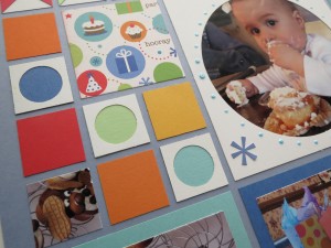
Several smaller circle tiles were used to frame some of the 1” square paper tiles in a multitude of colors.
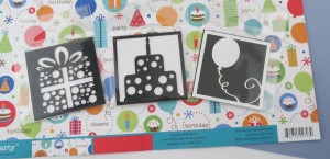
I pulled several cornerstones to consider, the gift, the balloon and the cake. Some had the circles and stars pattern that could fit with the pattern of the paper. However, in the end they didn’t work with my layout as it came together.
We have several colors of banner tiles and I found more than I needed to create my banner headline title. The sticker set had a swag banner of its own, but by using these banner tiles, I now had a perfect spot to place the stickers “birthday party” as a title. I used 1” white Paper Tiles at the bottom of each banner because it emphasized the banner with an arrow shape pointing upward to the title.
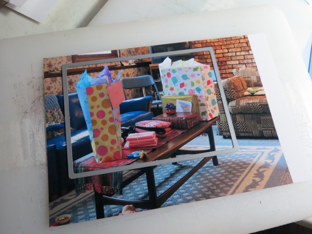
Paper tiles for photo mats continued to bring color into the multi-color palette. Using our layering dies to crop the photos left a nice color border around most of the photos.
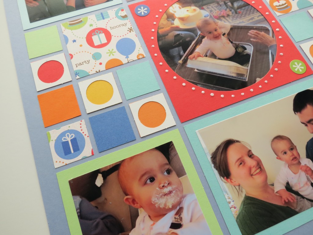
Birthday Scrapbook Pages: small Circle Tiles, Paper Tiles and Inspiration paper tile. Matted photos and fussy cut tiles.
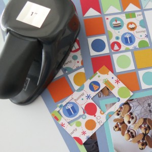
Only four 2 1/8” squares of the Inspiration Paper are included on the page. With the exception of two 1” squares that were fussy cut using a 1” square punch to cut sections of the paper to include in the squares. Our Square Die set also includes a 1” die to accomplish the same task. There were also a couple of photo scraps that were included as 1” squares.
And that’s how my Inspiration for Birthday Scrapbook Pages came about. I hope you can see how our many embellishments can really make your scrapbooking process stream lined and how our dies can give you consistent layers for great colorful borders of perfect fits for your blocks.
As always…we’d love to see what you’ve done with your inspirations! Our Mosaic Moments Facebook or Journella’s Story Board are perfect places to share.
Andrea Fisher
Colors used for this layout were: Periwinkle, Cobalt, Red, Lt. Aqua, Ocean Breeze, Pineapple Bliss, Tangelo Blast, Deep Orange Dream, Deep Peaches and Cream and Apple Crush.

