Updated June 2020
Many of you have expressed that you have a TON of white grid paper! You probably have a large collection of them from the tri-color packs. Or maybe you just have many left overs and don’t know what to do with all of this white paper! Although white may seem like a boring or dull option to go with your photos, my goal today is to get you excited about using this color. So get out your stash of white grid paper and get started with your summer scrappin!
Idea #1: Spritz It!
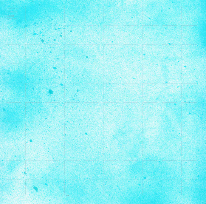
IF you don’t mind a little spray – get some Spritz! This is a fantastic way to add color to your white paper without sacrificing the grid lines.
[/vc_column][/vc_row][vc_row no_margin=”true” padding_top=”0px” padding_bottom=”0px” border=”none”][vc_column fade_animation_offset=”45px” width=”1/1″][/vc_column][/vc_row][vc_row no_margin=”true” padding_top=”0px” padding_bottom=”0px” border=”none”][vc_column fade_animation_offset=”45px” width=”1/2″]
 [/vc_column][vc_column fade_animation_offset=”45px” width=”1/2″]
There are all kinds of colors you can use! We used bright blue and green spray (From Tattered Angels™) which are fantastic for fun summer pages. If you went on a trip to Europe or a historic site, consider getting a brown spray for a distressed look. With spray you can add color in just a few spots or cover most of the paper.
Tip: The key is not to over do it on the spray – don’t try to get even coverage. You can use a a blow dryer for a fast finish.
[/vc_column][/vc_row][vc_row no_margin=”true” padding_top=”5px” padding_bottom=”5px” border=”none”][vc_column fade_animation_offset=”45px” width=”1/2″]The best part about white grid paper is you can make it into whatever color you want! Here, Tami used a blue tone that was not available at the time. Plus, we love how the spritz gives your grid paper a texture look with the variations of dark and lighter tones.
[/vc_column][vc_column fade_animation_offset=”45px” width=”1/2″]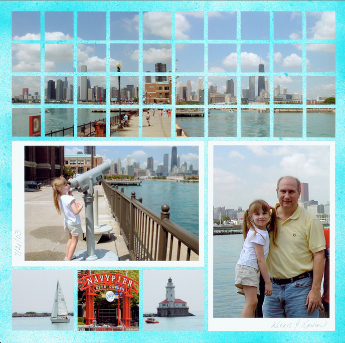
“Alexis & Kevin at Navy Pier” By Tami Potter – 12×12 White with Blue Spritz
[/vc_column][/vc_row][vc_row no_margin=”true” padding_top=”0px” padding_bottom=”0px” border=”none”][vc_column fade_animation_offset=”45px” width=”1/1″][/vc_column][/vc_row][vc_row no_margin=”true” padding_top=”0px” padding_bottom=”0px” border=”none”][vc_column fade_animation_offset=”45px” width=”1/1″]
Idea #2 – Stain It!
If White isn’t your favorite color – make it by adding a stain. You can find stains where stamping supplies are found in your local craft store. Stains are great for making your white sheet a new color. You can use multiple layers to make the stain darker or create a light and dark pattern as shown below:
[/vc_column][/vc_row][vc_row no_margin=”true” padding_top=”0px” padding_bottom=”0px” border=”none”][vc_column fade_animation_offset=”45px” width=”1/1″][/vc_column][/vc_row][vc_row no_margin=”true” padding_top=”0px” padding_bottom=”0px” border=”none”][vc_column fade_animation_offset=”45px” width=”1/2″]
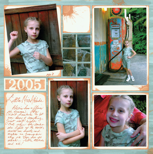
“Little Miss Attitude” By Tami Potter – 12×12 White stained with Tintz
[/vc_column][vc_column fade_animation_offset=”45px” width=”1/2″]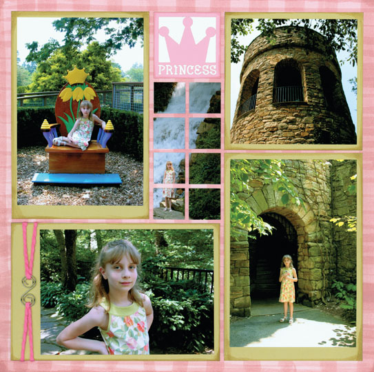
“Princess Alexis” By Tami Potter – 12×12 White stained with Tintz
[/vc_column][/vc_row][vc_row no_margin=”true” padding_top=”0px” padding_bottom=”0px” border=”none”][vc_column fade_animation_offset=”45px” width=”1/1″][/vc_column][/vc_row][vc_row padding_top=”0px” padding_bottom=”0px” border=”none”][vc_column fade_animation_offset=”45px” width=”1/1″]
Here are a few tips to make the process easy:
- place your grid paper on a large sheet of scrap paper to protect your surface
- tap the applicator tip on scrap paper to get it fully loaded
- “paint” stripes across the page running off the side of the paper onto your scrap paper.
- “splats” are created by tapping the applicator onto the paper until the desired size is achieved
- let the paper dry upside down to minimize curling – I like to weight the corners with the bottles
- if needed, you can roll the paper in the opposite direction to flatten paper (it will curl slightly)
- make sure you do not tint the paper so heavily that you can no longer see the grid lines
- use the tintz to ink the edges of your paper tiles, tags and Cornerstone backgrounds.
- experiment and have fun!
Idea #3- Bright & Bold!
If you think white is too simple and boring – think again! White allows you to use many bright and vibrant colors that might look too busy or do not fit with another grid color. So if you want to make a bold statement, have vibrant photos, or have a super bright summer patterned paper use White.
[/vc_column][/vc_row][vc_row no_margin=”true” padding_top=”0px” padding_bottom=”0px” border=”none”][vc_column fade_animation_offset=”45px” width=”1/1″][/vc_column][/vc_row][vc_row no_margin=”true” padding_top=”0px” padding_bottom=”0px” border=”none”][vc_column fade_animation_offset=”45px” width=”2/3″]
 [/vc_column][vc_column fade_animation_offset=”45px” width=”1/3″]
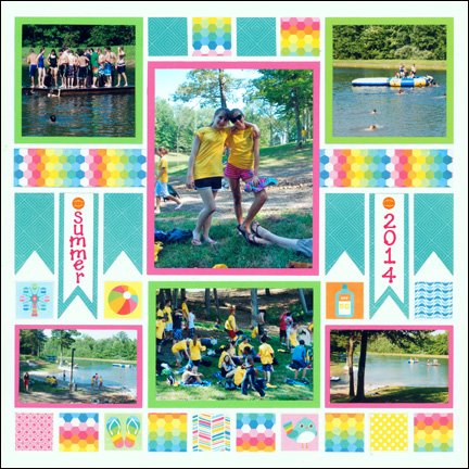
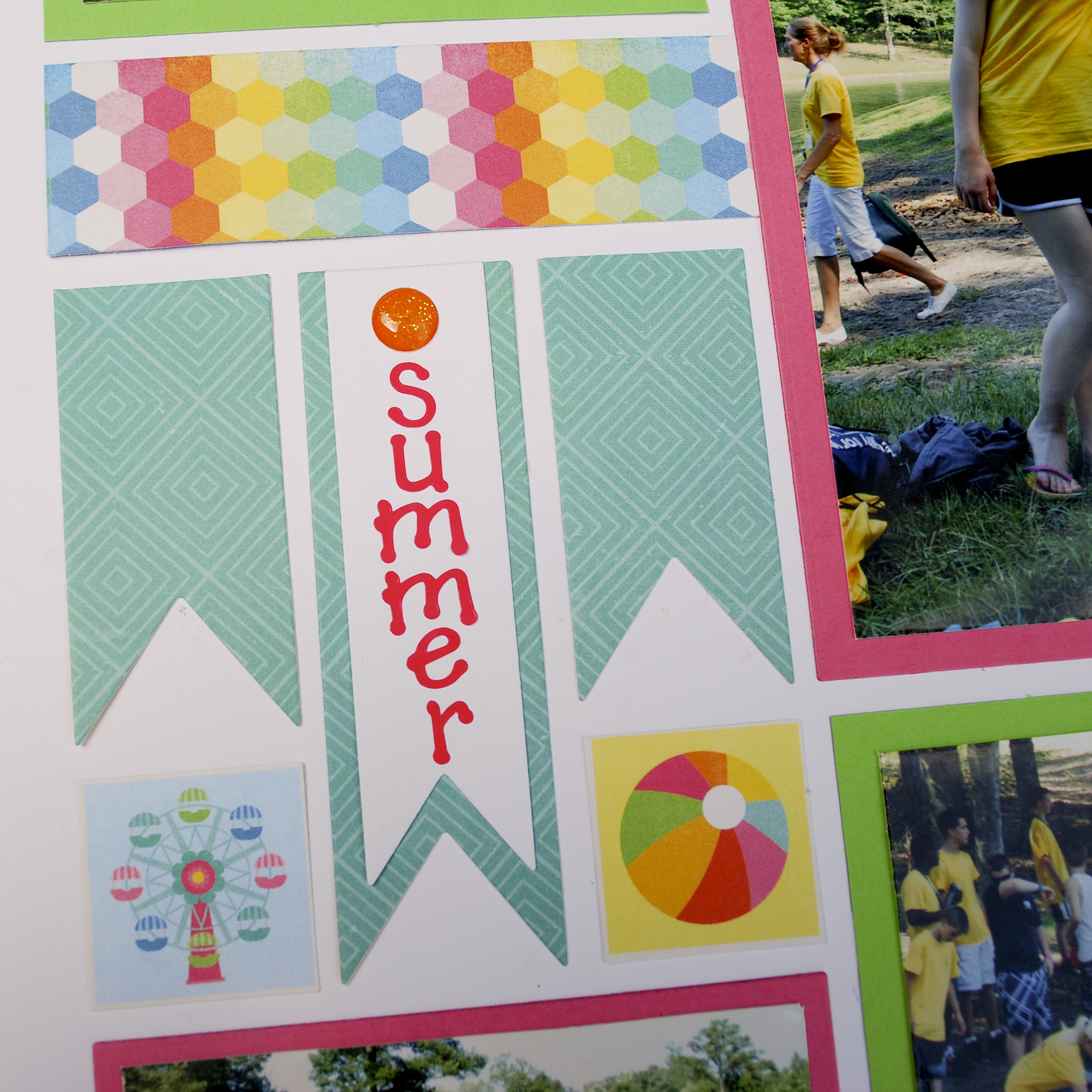
I wanted to make this page stand out! There is no way anyone could miss it while looking through my album. I wanted to portray the teens in these photos having a fun time on the lake. I grabbed some pattern paper from Echo Park™ (love their ‘I love Sunshine’ collection!) and made this vibrant page. It’s definitely not boring or dull!
[/vc_column][/vc_row][vc_row no_margin=”true” padding_top=”0px” padding_bottom=”0px” border=”none”][vc_column fade_animation_offset=”45px” width=”1/1″][/vc_column][/vc_row][vc_row no_margin=”true” padding_top=”0px” padding_bottom=”0px” border=”none”][vc_column fade_animation_offset=”45px” width=”1/2″]
 [/vc_column][vc_column fade_animation_offset=”45px” width=”1/2″]
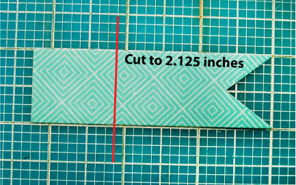
Quick Tip: Cut some banners shorter for variation. It’s easy! Use your mat to cut them to 2.125 inches. Make sure to start measuring at the banner looking edge – as shown in the photo below.
 [/vc_column][/vc_row][vc_row no_margin=”true” padding_top=”0px” padding_bottom=”0px” border=”none”][vc_column fade_animation_offset=”45px” width=”1/1″]
[/vc_column][/vc_row][vc_row padding_top=”0px” padding_bottom=”0px” border=”none”][vc_column fade_animation_offset=”45px” width=”1/2″]
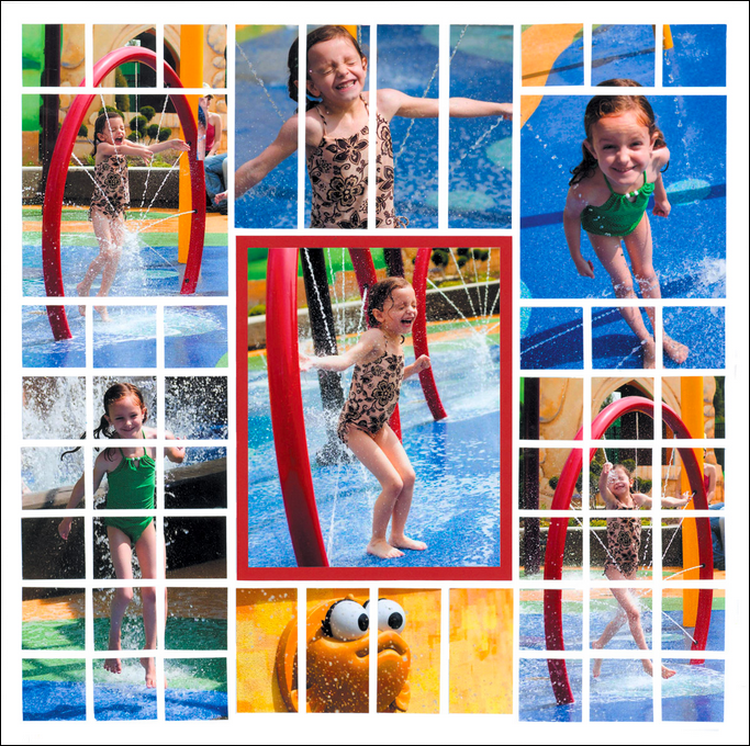
“Splish Splash” by Nicole Pasquini
Sometimes you may have photos with a lot of bright colors. White helps the colors stand out without seeming too busy.
[/vc_column][vc_column fade_animation_offset=”45px” width=”1/2″]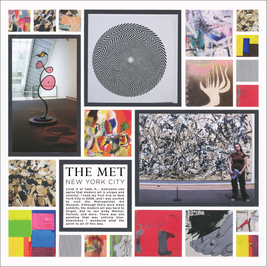
“The Met – Modern Art” by Paije Potter
There is a lot going on this page! I chose white since it matched with the museum feel and the jumble of colors stick out more.
[/vc_column][/vc_row][vc_row no_margin=”true” padding_top=”0px” padding_bottom=”0px” border=”none”][vc_column fade_animation_offset=”45px” width=”1/1″]Idea #4 – Black, White, & a POP of color.
If you want a more formal or contemporary feel to your page, a black and white color scheme is always classy. This style is sleek and modern. It’s fabulous for weddings, graduations, or formal portraits. You can also add a pop of color for more variation and to add an element that stands out.
A white background is perfect for a clean and modern look. You can also add a little more interest to your page by embossing some of the card-stock, adding ribbon, or metal accents.
[/vc_column][/vc_row][vc_row no_margin=”true” padding_top=”0px” padding_bottom=”0px” border=”none”][vc_column fade_animation_offset=”45px” width=”1/1″][/vc_column][/vc_row][vc_row no_margin=”true” padding_top=”0px” padding_bottom=”0px” border=”none”][vc_column fade_animation_offset=”45px” width=”1/2″]
 [/vc_column][vc_column fade_animation_offset=”45px” width=”1/2″]
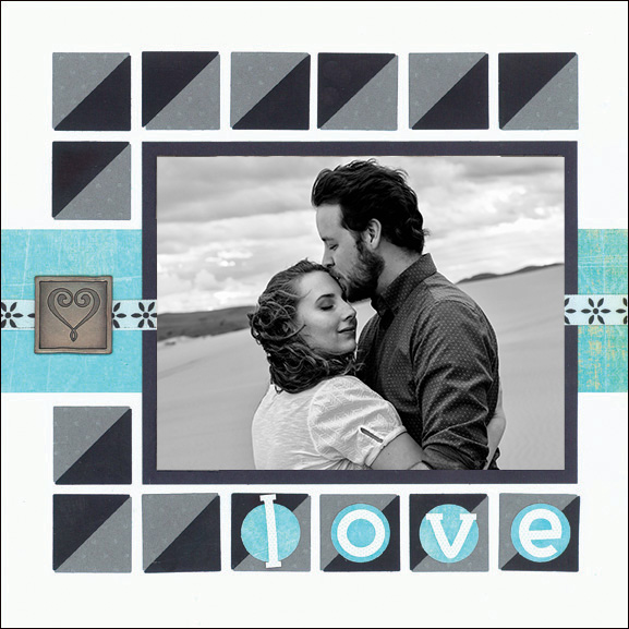
I love this 8×8 white page! It has a very modern feel. I used the Corner Tile dies to make a stripe pattern that goes across the entire page. I also love aqua and added it to my Black and White color scheme.
[/vc_column][/vc_row][vc_row no_margin=”true” padding_top=”0px” padding_bottom=”0px” border=”none”][vc_column fade_animation_offset=”45px” width=”1/1″]# 5 – White on White
If you are going to wedding, taking formal family portraits, or going to a formal event, White on White pages are elegant and lovely. But, you might be thinking how does white on white work? Or how would that look good or not be too boring? Take a look at the page below and the tips to find out how to create a beautiful page.
[/vc_column][/vc_row][vc_row no_margin=”true” padding_top=”0px” padding_bottom=”0px” border=”none”][vc_column fade_animation_offset=”45px” width=”1/1″][/vc_column][/vc_row][vc_row no_margin=”true” padding_top=”0px” padding_bottom=”0px” border=”none”][vc_column fade_animation_offset=”45px” width=”2/3″]
 [/vc_column][vc_column fade_animation_offset=”45px” width=”1/3″]
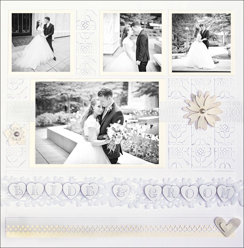
How do you get White on White to work? This is a great opportunity to play with a lot of textures and adding embellishments and adding a bit of glimmer! I HIGHLY recommend only using Black and White photos. Color photos would be too overwhelming over the white.
Add Texture such as embossed paper and glittery stickers. I also added a fabric ribbon for more texture and interest.
Add layers. On this page I layered multiple papers and embellishments.
[/vc_column][/vc_row][vc_row no_margin=”true” padding_top=”0px” padding_bottom=”0px” border=”none”][vc_column fade_animation_offset=”45px” width=”1/2″]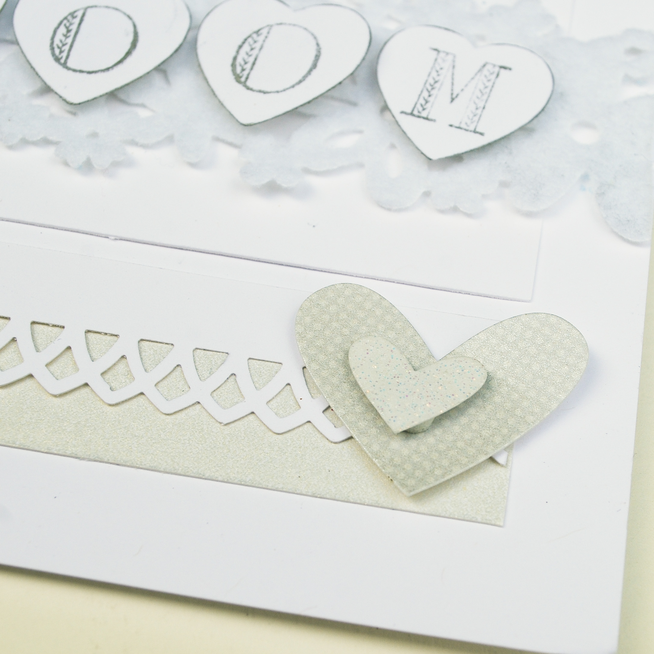
Close up of the heart sticker at the bottom of the page. Plus you can see the punched out layer over the silver cardstock. I love using elegant border punch designs for wedding pages. This pattern was made with a Martha Stewart punch.
[/vc_column][vc_column fade_animation_offset=”45px” width=”1/2″]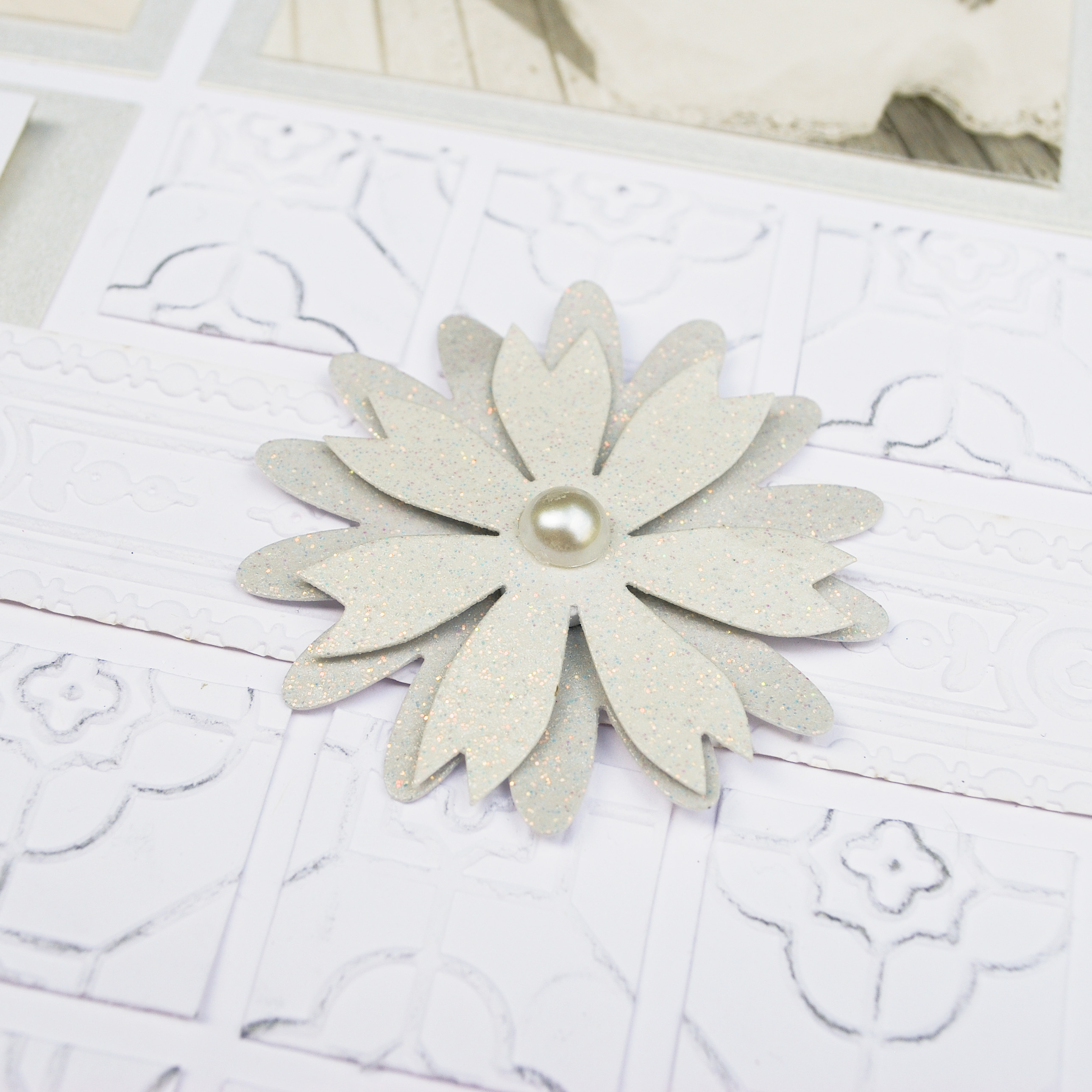
Here is a close up of the large floral sticker. I love all the glitter and pearl center. Below it is white cardstock that was embossed. I added silver chalk ink on some of the embossed areas to add interest and contrast. This is a great example of adding texture.
[/vc_column][/vc_row]
